
Demonstrate various Android UI Features
landenlabs.comDec-2019
| Source code | all-uitest-src.zip |
| Android APK (min API 23) zip'd | all-uitest-apk.zip |
| Android APK (min API 23) | all-uitest.apk |
| WARNING - Chrome on 4.2 will get stuck trying to download APK, use a different browser like FireFox | |
| GitHub source | https://github.com/landenlabs/all-uitest |
This app contains a collection of pages which demonstrate various Android UI features.
Key Features:
Contents:
<animated-vector
    xmlns:android="http://schemas.android.com/apk/res/android"
    xmlns:aapt="http://schemas.android.com/aapt">
    <aapt:attr name="android:drawable">
        <vector
            android:width="10dp"
            android:height="10dp"
            android:viewportWidth="100"
            android:viewportHeight="100">

            <group  android:name="grad"  android:translateY="100">
                <path android:pathData="M1,1 H99 V99 H1Z">
                    <aapt:attr name="android:fillColor">
                        <gradient
                            android:endColor="#ffff"
                            android:endX="0"
                            android:endY="99"
                            android:startColor="#0fff"
                            android:startX="0"
                            android:startY="0"
                            android:type="linear" />
                    </aapt:attr>
                </path>
            </group>
        </vector>
    </aapt:attr>

    <target android:name="grad">
        <aapt:attr name="android:animation">
            <objectAnimator
                android:duration="1000"
                android:propertyName="translateY"
                android:valueFrom="100"
                android:valueTo="0"
                android:valueType="floatType" />
        </aapt:attr>
    </target>

</animated-vector>
The animation is started by attaching the AnimatedVectorDrawable, applying a tint and starting the animator.
ColorStateList colorRed = new ColorStateList(
        new int[][]{ new int[]{}},
        new int[]{  0xffff0000 }    // RED
);
ColorStateList colorGreen = new ColorStateList(
        new int[][]{ new int[]{}},
        new int[]{  0xff00ff00 }    // GREEN
);

view.setBackgroundResource(R.drawable.anim_grady1);
view.setBackgroundTintList(Math.random() > 0.5 ? colorRed : colorGreen);
((AnimatedVectorDrawable) view.getBackground()).start();

In this demonstration I set the scale pivot to different corners to encourage the expansion to stay over the parent container.

By loading the drawable as a BitmapShader you can clamp its edges which are then replicated to fill the target area. By using a Matrix you can scale and translate the image to orient it correctly.
/**
* Create a clamped texture bitmap which can be shifted to fill view's background.
*/
void init() {
    BitmapDrawable bgBitmap = (BitmapDrawable)
    getResources().getDrawable(R.drawable.white_varrow, getContext().getTheme());
    bgWidthPx = bgBitmap.getBitmap().getWidth();
    bgHeightPx = bgBitmap.getBitmap().getHeight();
    bgShader = new BitmapShader(bgBitmap.getBitmap(), Shader.TileMode.CLAMP, Shader.TileMode.CLAMP);
}
Here is the matrix math to shift the image horizontally to get the arrow oriented correctly. This code also draws the image twice to add a shadow. The background image is drawn in a rectangle which clips the background leaving a transparent zone on the bottom. The bottom zone is used to draw a 2nd image to give a floating button look.
// Position the background image so the bg image center is in the center of this
// views bounds and then shift the background by the optional user provided
// view x pixel offset.
mMatrix.reset();
float xViewOffsetPx =  Float.isNaN(xOffsetPx) ? 0 : xOffsetPx;
float xShiftToCenterBg = (getWidth() - bgWidthPx)/2f;
mMatrix.postTranslate(xShiftToCenterBg + xViewOffsetPx, 0);
mMatrix.postTranslate(shadowSize, shadowSize);
bgShader.setLocalMatrix(mMatrix);

// paint.setStyle(Paint.Style.FILL);
paint.setShader(bgShader);

RectF shadoeCoverage = new RectF(0, 0, getRight(), getBottom()-50);
setShadowTint(paint);
canvas.drawRect(shadoeCoverage, paint);

// Tint the background.
setBlueTint(paint);
RectF bgCoverage = new RectF(0, 0, getRight()-shadowSize, getBottom()-50-shadowSize);
mMatrix.postTranslate(-shadowSize, -shadowSize);
bgShader.setLocalMatrix(mMatrix);
canvas.drawRect(bgCoverage, paint);
paint.setShader(null);


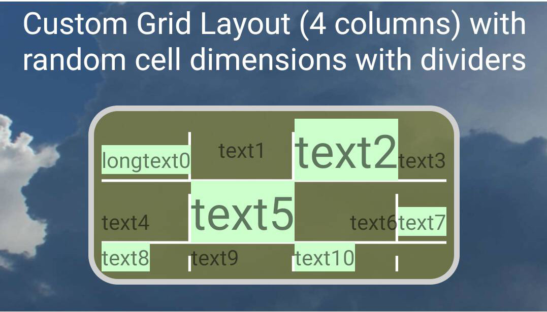
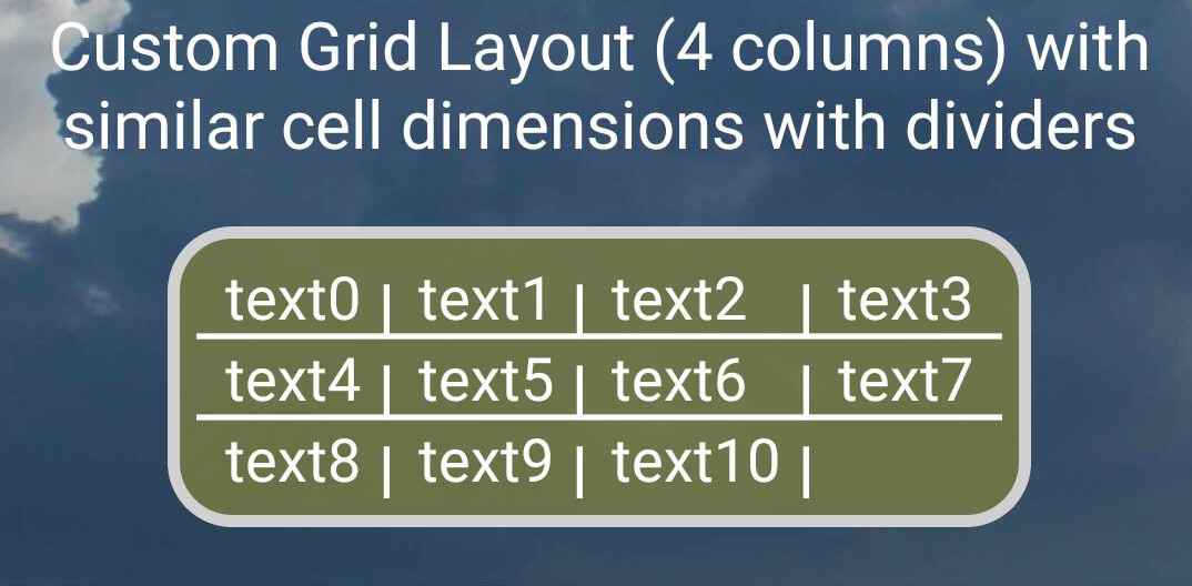
I also included a customized version of a GridLayout which provides cell dividers. The custom GridLayout is hardcoded using constants and resource values to draw the dividers.

Here is the Layout used to create the above TableLayout with dividers.
<TableLayout
    android:id="@+id/other_tableLayout"
    android:layout_width="match_parent"
    android:layout_height="wrap_content"
    android:layout_margin="20dp"
    android:background="@drawable/round_border3"
    android:divider="@drawable/hline"
    android:padding="10dp"
    android:showDividers="middle|end">

    <TableRow
        android:baselineAligned="false"
        android:divider="@drawable/vline"
        android:showDividers="middle">

        <TextView
            android:layout_width="0dp"
            android:layout_gravity="bottom"
            android:layout_weight="1"
            android:ellipsize="none"
            android:gravity="bottom"
            android:singleLine="true"
            android:text="longertext0" />

        <ImageView
            android:layout_width="0dp"
            android:layout_gravity="bottom"
            android:layout_weight="1"
            android:adjustViewBounds="true"
            android:src="@drawable/scr_hourly" />

        <ImageView
            android:layout_width="0dp"
            android:layout_height="40dp"
            android:layout_gravity="bottom"
            android:layout_weight="1"
            android:src="@drawable/scr_hourly" />

        <ImageView
            android:layout_width="0dp"
            android:layout_height="50dp"
            android:layout_gravity="bottom"
            android:layout_weight="1"
            android:src="@drawable/scr_hourly" />

        <TextView
            android:layout_width="0dp"
            android:layout_gravity="bottom"
            android:layout_weight="1"
            android:ellipsize="none"
            android:singleLine="true"
            android:text="text2"
            android:textSize="30sp" />
    </TableRow>

    <LinearLayout
        android:layout_width="match_parent"
        android:layout_height="40dp"
        android:baselineAligned="false"
        android:divider="@drawable/vline"
        android:orientation="horizontal"
        android:showDividers="middle">

        <TextView
            android:layout_width="0dp"
            android:layout_height="wrap_content"
            android:layout_gravity="bottom"
            android:layout_weight="1"
            android:text="longtext1" />

        <ImageView
            android:layout_width="0dp"
            android:layout_height="match_parent"
            android:layout_gravity="bottom"
            android:layout_weight="1"
            android:adjustViewBounds="true"
            android:src="@drawable/scr_hourly" />

        <TextView
            android:layout_width="0dp"
            android:layout_height="wrap_content"
            android:layout_gravity="bottom"
            android:layout_weight="1"
            android:text="text3" />

        <TextView
            android:layout_width="0dp"
            android:layout_height="wrap_content"
            android:layout_gravity="bottom"
            android:layout_weight="1"
            android:text="text4444"
            android:textSize="30sp" />

        <TextView
            android:layout_width="0dp"
            android:layout_height="wrap_content"
            android:layout_gravity="bottom"
            android:layout_weight="1"
            android:text="text5" />
    </LinearLayout>

</TableLayout>
The following two layouts are using a custom GridLayout which adds the dividers
<utils.GridLayoutExt1
    android:background="@drawable/round_border3"
    android:layout_gravity="center"
    android:layout_width="wrap_content"
    android:layout_height="wrap_content"
    android:layout_margin="20dp"
    android:columnCount="4"
    android:padding="10dp">

    <TextView style="@style/gridText" android:text="text0" />
    <TextView style="@style/gridText" android:text="text1" />
    <TextView style="@style/gridText" android:text="text2"  />
    <TextView style="@style/gridText" android:text="text3"  />
    <TextView style="@style/gridText" android:text="text4" />
    <TextView style="@style/gridText" android:text="text5"  />
    <TextView style="@style/gridText" android:text="text6" />
    <TextView style="@style/gridText" android:text="text7"  />
    <TextView style="@style/gridText" android:text="text8" />
    <TextView style="@style/gridText" android:text="text9" />
    <TextView style="@style/gridText" android:text="text10"  />
</utils.GridLayoutExt1>
As part of the previous section a TableLayout was created with two rows. One row uses a TableRow and the other a LinearLayout. Both perform equally well and both support automatic dividers and tolerate transforming their children without impacting the other children.
The GridLayout needed some help to prevent it from adjusting its children. So the custom gridlayout used in the previous section was further improved to add a locking feature to prevent layout adjustments.
First image shows our background gradient animation.

Second image shows the expansion animation, also showing how cells can grow larger then parent.

The last image shows the overlay dialog.


Row expansion

Column expansion

Box expansion

Syntax code highligter provided by https://highlightjs.org